BRANDING PROJECT
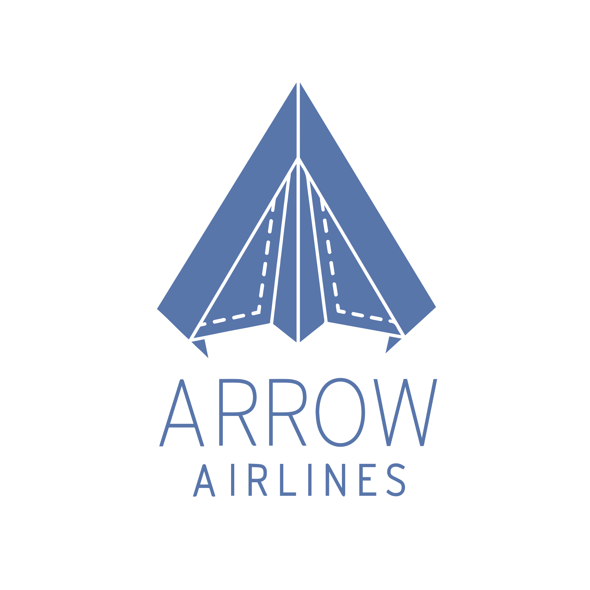
This is a project directed towards branding an airline company. The objective of this project was to create a logo and other collateral including business cards to complete the branding that I created. My concept was to create a clean brand focused on making flying simple, affordable, and reliable. The vision for this brand was to make people feel relaxed and at ease while flying knowing they would get to their destination on time and for a good price. Some of the key features in the design that I think reflect this goal is the simple color palette that is just different shades of blue and white. As well as the clean lines used to make the logo in the shape of an arrow. I also used dotted lines in the logo to represent the shape of airplane windows, and also made the silhouette of the logo look like a paper airplane to give it a little playful effect. This project was critiqued by my professors and with their help I was able to make various edits and overcame some design challenges. For example, while creating a business card the pattern on the front was too distracting at first when put under the logo, so with my professor's help we simplified the pattern and made the background and pattern have a very low contrast. This project was one of my first dives into graphic design and branding. It allowed me to play around freely with the branding, get a feel for the design process, and of course there is more that could be improved on.

